Burger King App · Native Mobile Ordering
Tillster · Quick Service Restaurant

TL;DR
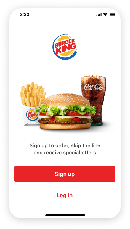
We partnered with Burger King's leadership to launch their first native US app, blending integrated payments, loyalty, and coupons into a modern, platform-native experience. By establishing scalable design guidelines across iOS and Android, we balanced brand vibrancy with intuitive flows—driving engagement and upsell in just six months.
Problem Statement
Burger King lacked a native app for US users, relying on web-based ordering that missed native interactions, payments, and loyalty hooks. Our challenge: craft a cohesive design language for iOS and Material Design while scaling best practices for Tillster's future apps, all without diluting the brand's bold identity or hindering franchise throughput.
Project Background
Project Goals: Pioneering Native Apps
We aimed to launch Burger King's first US native app—integrating payments, loyalty, and coupons—while crafting scalable guidelines and handoff processes to fuel Tillster's future builds across iOS and Android.
Design Challenge: First-Time Native, Team-Wide
With most of the team new to native builds, we leaned on tight collaboration to define asset handoff best practices. At the same time, we shaped an inclusive, platform-native design language to deliver a consistent, cohesive experience across iOS and Android.
Success Metrics: Driving Engagement & Revenue
Boost coupon engagement to increase perceived meal value and improve customer retention.
Increase order frequency and overall throughput across locations.
Unlock strategic upsell moments to grow average transaction value for US franchise partners.
Duration
6 months
2 CEOs
CMO
VP of UX
Creative Director
Senior Product Designer 👋
Production Designer
3 Engineers
Legal team
TEAM
Software
Sketch, Zeplin, Adobe Suite
Design Process
What did we start with?

Visual Foundation: Minimal Design, Maximum Appetite
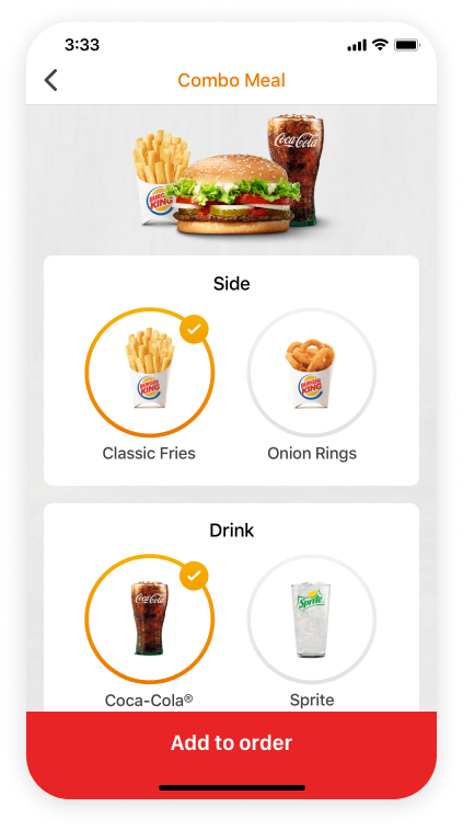
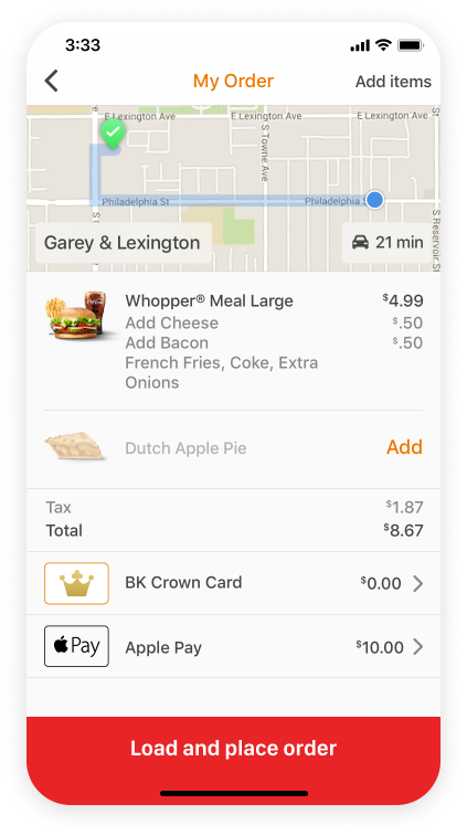
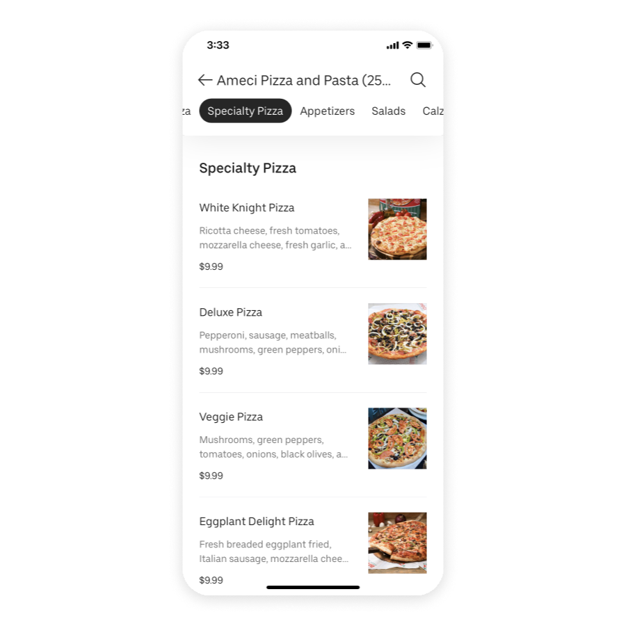
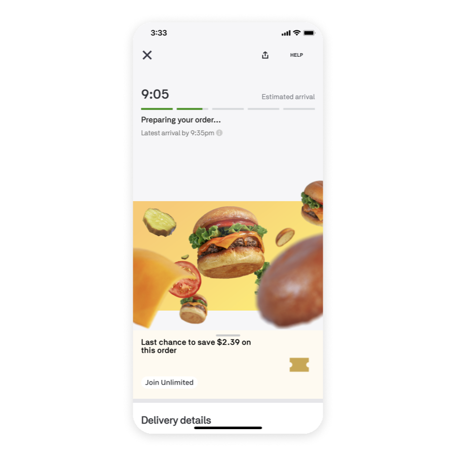
We started with BK’s branding, marketing assets, and product photography, shaping a clean, minimal interface where bold, sensory-rich imagery took center stage. Color was used sparingly—only for actions and system cues—to guide attention, reduce clutter, and keep the focus on the food.

Native Design Language: Platform Harmony
We adapted Burger King’s bold identity to both Material Design and iOS guidelines, defining unified specs for components, interactions, and visual rhythm. Close partnership with front-end teams ensured consistent, native-feeling execution across Android and iOS—without compromising brand energy.
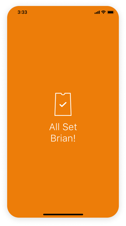
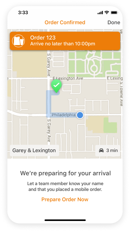
Design Themes: Modern, Minimal, and Mouthwatering
Menus built for scannable clarity and effortless navigation.
Brand moments that celebrate Burger King’s bold identity.
Cart flows optimized for frictionless conversion.
Sensory-rich product photography that triggers appetite.
Intuitive loyalty and redemption paths that feel rewarding.
Design Goals: Native, Minimal, and Delightful
Modernize product and brand presentation with sensory focus.
Adhere to native iOS and Material Design guidelines for styles, components, and interactions.
Use a neutral theme with color reserved for action-driven elements.
Develop a native-aligned custom iconography system.
Infuse personalized, delightful moments throughout the user journey.
Final Design: Native, Craveable, and Seamless-App
We delivered a modern, minimal native experience across iOS and Android, anchored in sensory product photography, action-focused color, and a unified icon system. The result: intuitive ordering, rewarding loyalty, and bold brand moments—all optimized for ease, engagement, and conversion.