WM Store · eCommerce
Weedmaps · Direct to Consumer
TL;DR
Upgraded Weedmaps eCommerce: seamless checkout, secure payments, loyalty, locator UX and optimized dark-mode. Launched globally Aug 2022. Boosted brand trust with consistent, polished experiences and empowered retailers with faster conversions and stronger loyalty through collaborative, KPI-aligned design.
Problem Statement
Retailers and brands in the cannabis industry needed a robust eCommerce platform for a seamless ordering experience, integrating secure payments and loyalty programs to boost customer engagement and retention.
Project Background
THE GOAL
Deliver design solutions that enable payment and loyalty integration features for both consumers and clients.
Cross-Functional Collaboration
The project required working closely with various teams to ensure that new features were integrated seamlessly, with engineering and design teams sharing patterns and best practices to deliver a unified experience.
SUCCESS METRICS
The success of our design solutions was measured by key business outcomes, including:
Increased Payment and Loyalty Adoption: Driving client and consumer engagement with payment and loyalty programs.
Enhanced Customer Value: Delivering value to consumers with each purchase, fostering loyalty and retention.
Improved Order Frequency and Throughput: Encouraging repeat business and streamlining the purchasing process to drive growth.
DURATION
5 months
Team
General Manager
Product Manager
Senior Product Designer 👋
Senior UX Researcher
Senior Engineering Manager
3 Front-End Engineers
3 Back-End Engineers
Legal team
SOFTWARE
Figma, Atlassian, UserTesting, Google Docs
Design Process
What did we start with?

Key Challenges
No design specs for MVP led to usability issues.
Lack of design patterns promoting accessibility.
Required clear direction for engineers to ensure consistency and quality.

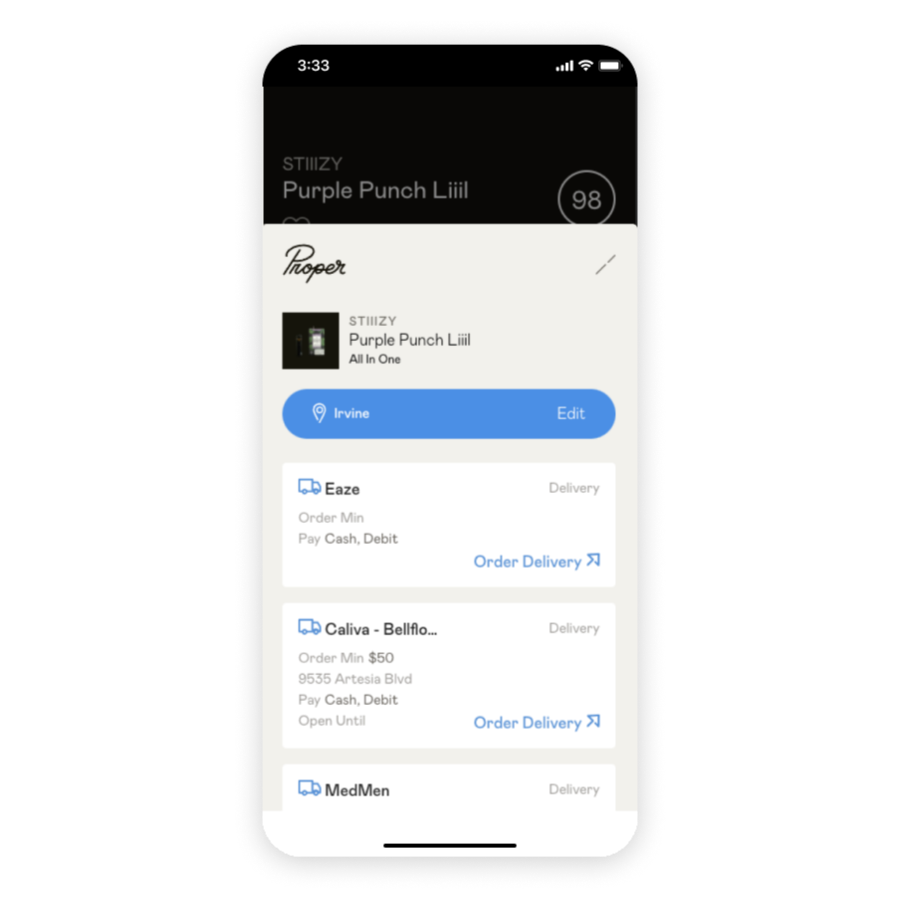
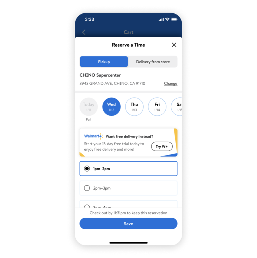
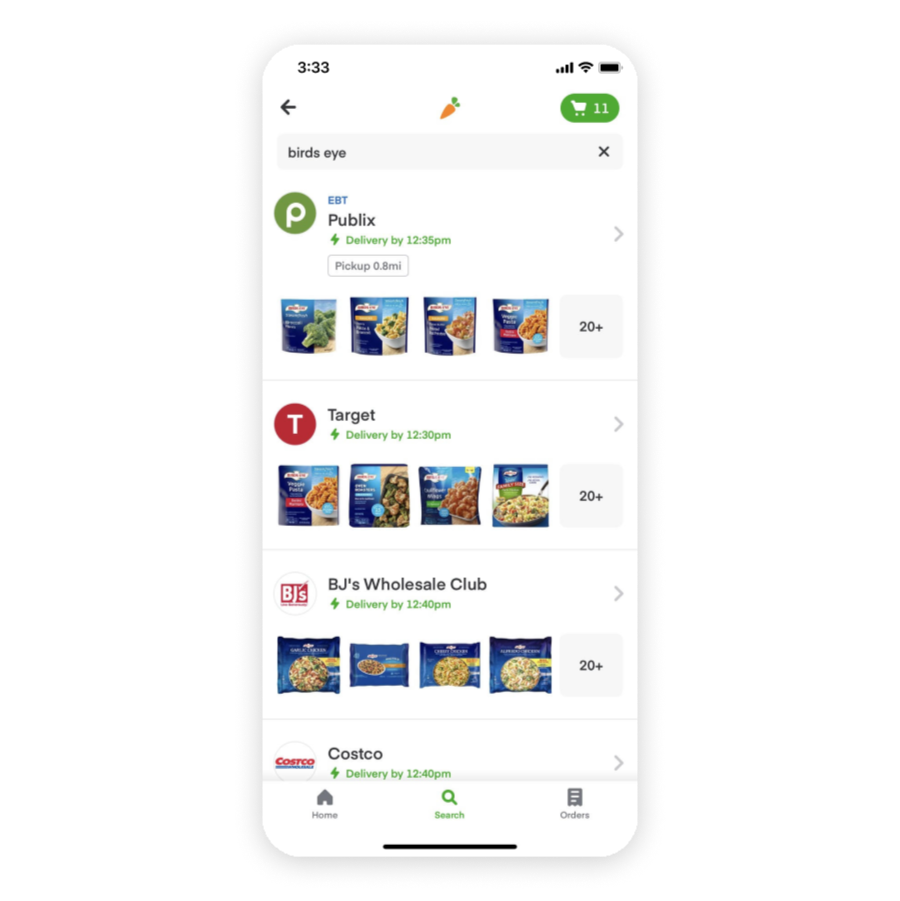
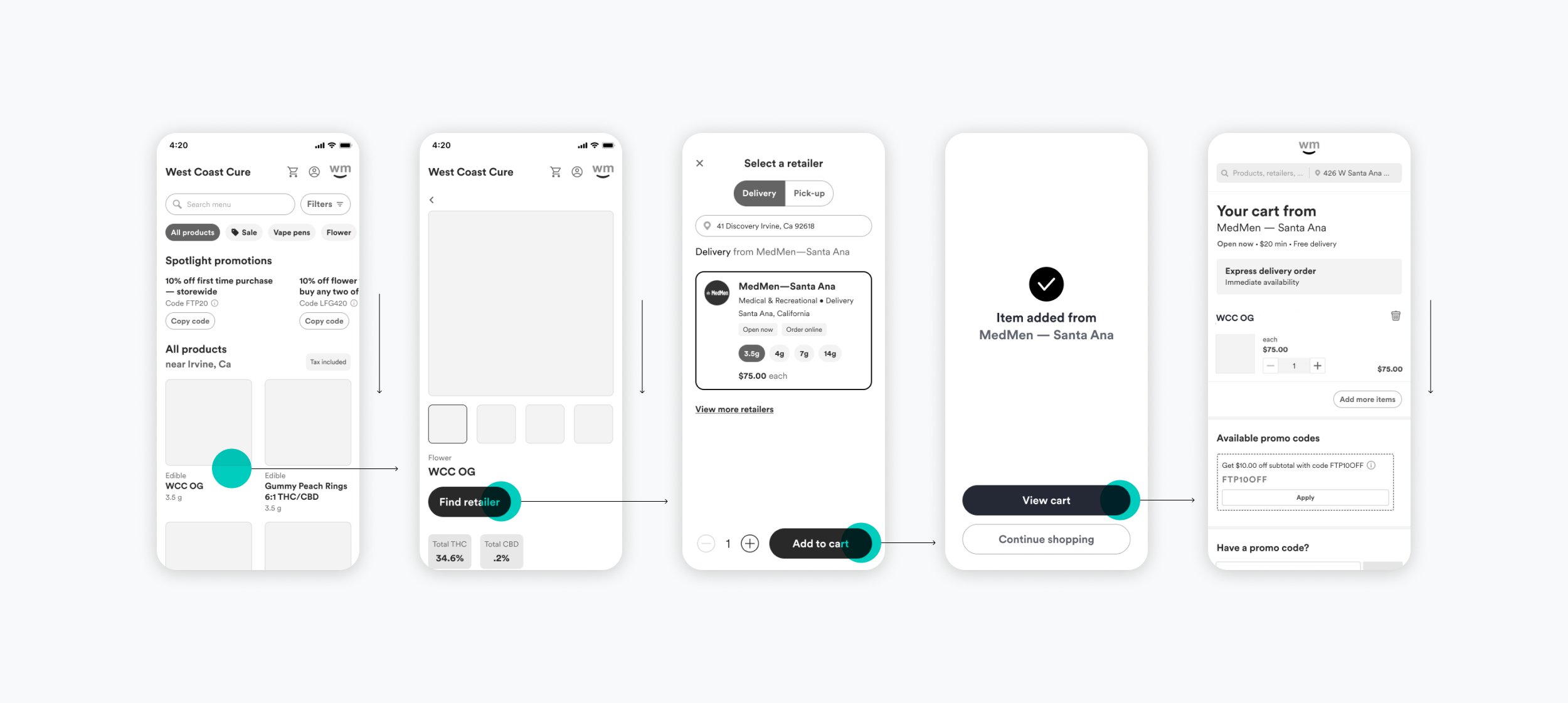
Inline Retail Locator
The original retail locator, embedded on product detail pages via inline anchoring, caused usability issues:
On longer pages, the interaction felt disorienting.
After locating, the page state became ambiguous.
The retailer list missed opportunities to showcase premium retailers through our "Jackpot Marketing" feature, which highlights top retailers in each region.

Dark Theme
Our engineering team implemented dark theme styles in v1, but an audit revealed inconsistencies with our Style Guide color swatches. To address this, I proposed defining a cohesive dark theme by inverting our existing light theme specs, ensuring a consistent brand experience.

WM Design Style Guide
As WM Store introduced WM's first consumer-facing dark theme, I helped establish guidelines for applying color consistently. This ensured a cohesive brand experience and set a precedent for future design applications.
Design InspIration
To inform our design decisions, various sources were gathered including:
Dark theme designs that balance aesthetics and usability.
Touch-friendly patterns that prioritize intuitive interactions.
Innovative retail locator experiences that streamline user flows.
eCommerce conversion patterns that optimize for payment and loyalty.


Design Goals
Optimize Retail Locator Experience: Streamline the user flow for finding retailers.
Highlight Premium Retailers: Support "Jackpot Retailer" logic to showcase top retailers.
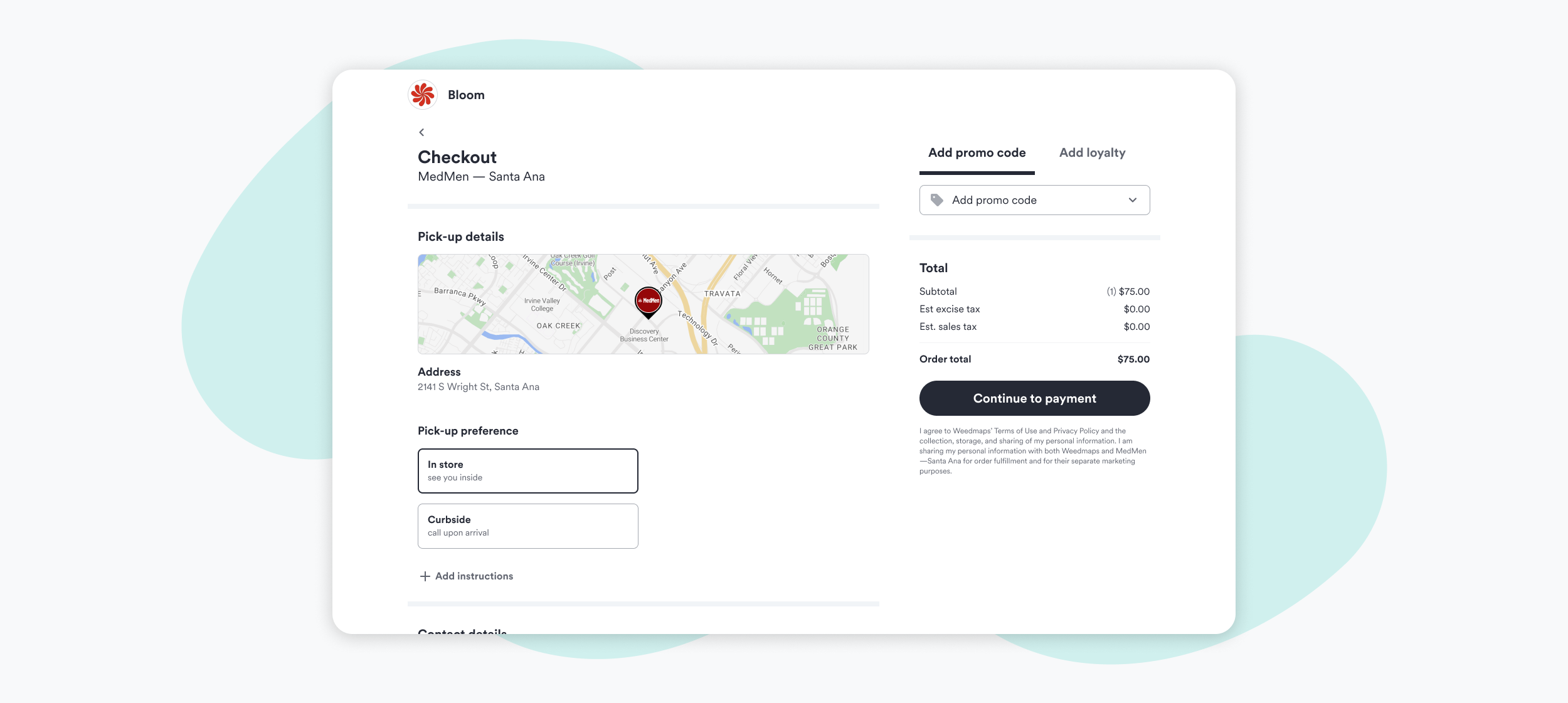
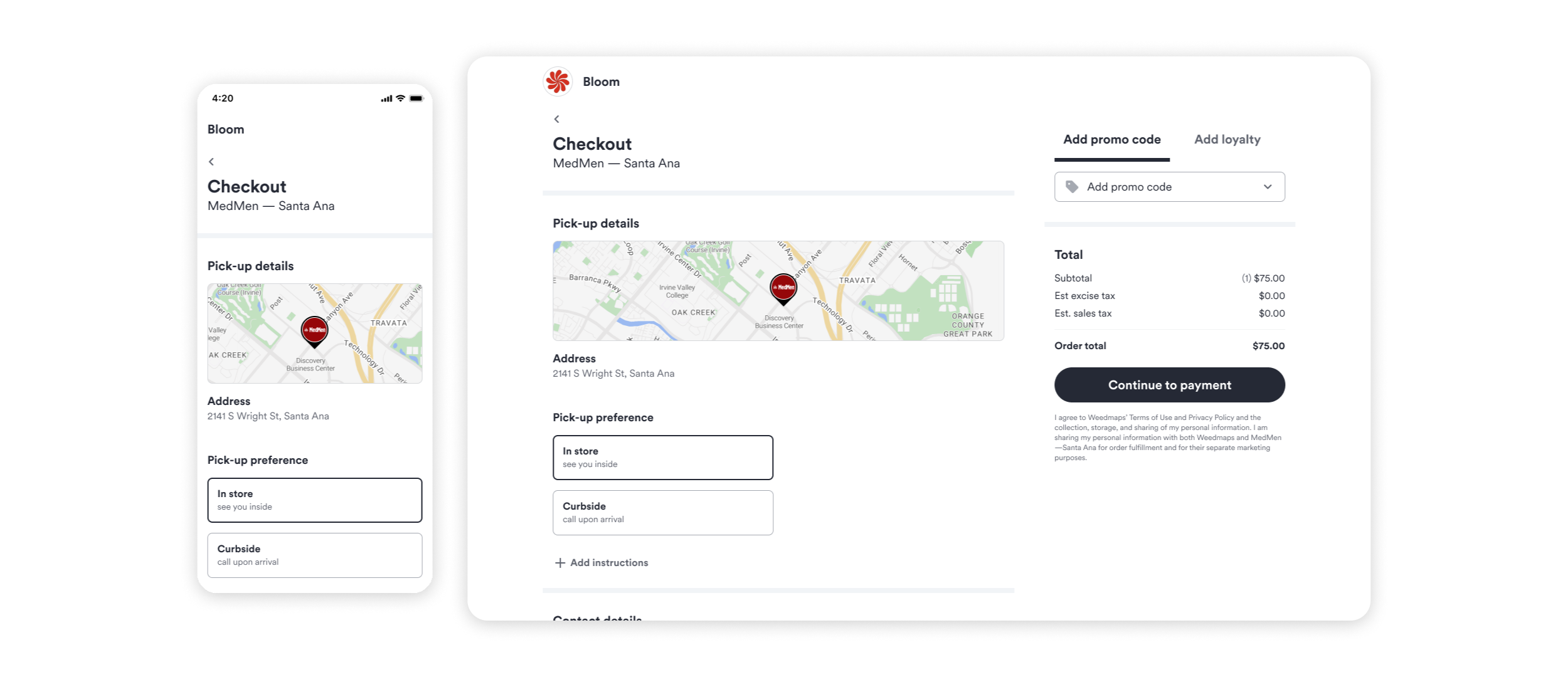
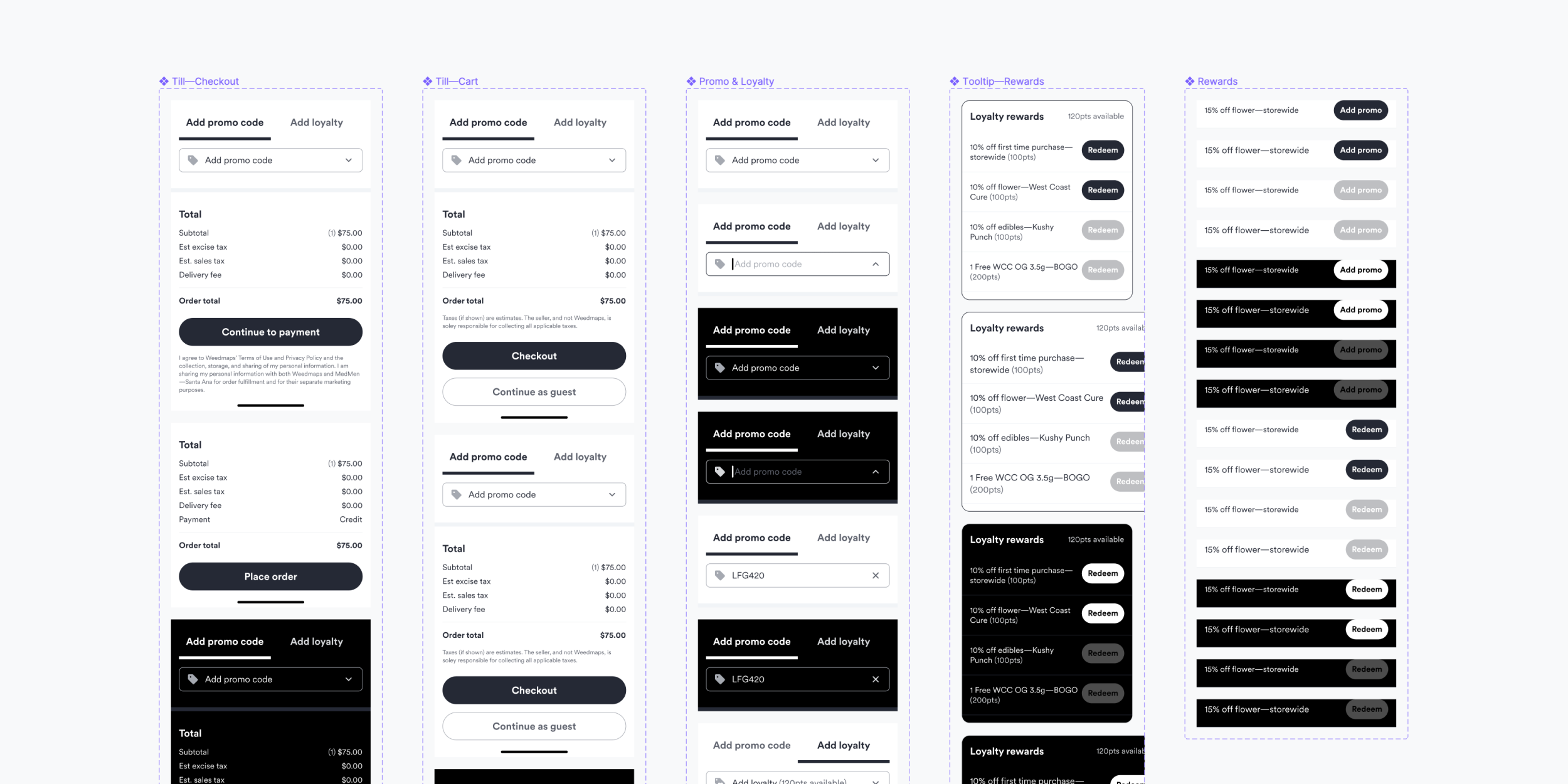
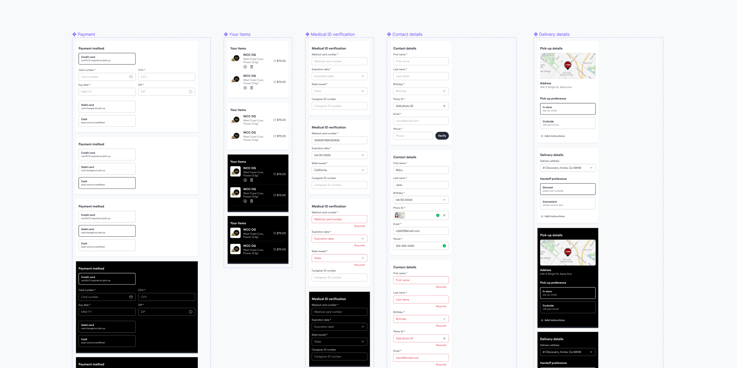
Unified Checkout Experience: Collaborate with the Orders design team to co-design checkout components.
Dark Theme Consistency: Define guidelines for a cohesive dark theme experience.
Style Guide Alignment: Ensure components adhere to our Style Guide.
Accessibility: Address usability issues and ensure inclusivity.
Touch-Friendly Interactions: Design intuitive, touch-friendly interfaces.
Mobile-First Approach: Prioritize mobile design to ensure a seamless experience.
Wireframes
Low-fidelity wireframes were created to define the user experience and visualize the flow of key features, including the retail locator and checkout process. These wireframes helped establish a solid foundation for the design, allowing for iteration and refinement before moving to high-fidelity designs.

Custom components
To ensure consistency across multiple teams and flows, we developed a library of reusable custom components in Figma. These components were designed to be flexible, scalable, and easily maintainable, promoting a cohesive user experience throughout the WM Store ecosystem.

UX Research
Before handing off specs, we collaborated with our UX Researcher to objectively assess our design solutions. Key findings included:
Retail Locator Experience: Participants rated the optimized experience 4.6/5, confirming its effectiveness.
Promo & Loyalty Rewards: 100% of participants easily discovered rewards in the cart, validating our design decisions.
Final design
The culmination of our design efforts resulted in a seamless, user-friendly experience that met our objectives. Key successes include:
Streamlined Retail Locator Experience: With a 4.6/5 user rating, our optimized retail locator experience significantly improved usability and reduced friction.
Consistent Dark Theme: Our defined dark theme guidelines ensured a cohesive brand experience, aligning with our Style Guide and enhancing visual accessibility.
Unified Checkout Experience: Collaboration with the Orders design team yielded a co-designed checkout process that enabled payment, loyalty and streamlined interactions.
Accessible and Touch-Friendly: Our responsive design solutions addressed accessibility issues and encouraged intuitive, touch-friendly interactions, ensuring an inclusive experience.
Reusable Components: Our custom component library in Figma promoted consistency across teams and flows, reducing design debt and improving maintainability.